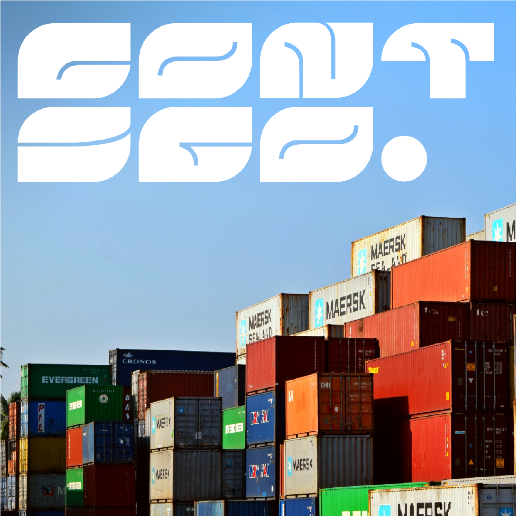
This alternative version of the Coca-Cola logo was undertook with the intention of injecting a contemporary aesthetic into this iconic emblem. By maintaining a consistent width and adopting a minimalist approach, I aimed to balance the brand's enduring legacy with a fresh and modern visual appeal. This reinterpretation serves as a testament to the adaptability and timelessness of Coca-Cola's visual identity, bridging the past with a forward-looking design sensibility.
-
Cette version alternative du logo Coca-Cola a été entreprise dans le but d'insuffler une esthétique contemporaine à cet emblème iconique. En conservant une largeur de graisse constante et en adoptant une approche minimaliste, l'objectif était d'équilibrer l'héritage durable de la marque avec une attrait visuel frais et moderne. Cette réinterprétation témoigne de l'adaptabilité et de la pérennité de l'identité visuelle de Coca-Cola, établissant ainsi un lien entre le passé et une sensibilité envers une forme de design tournée vers l'avenir.