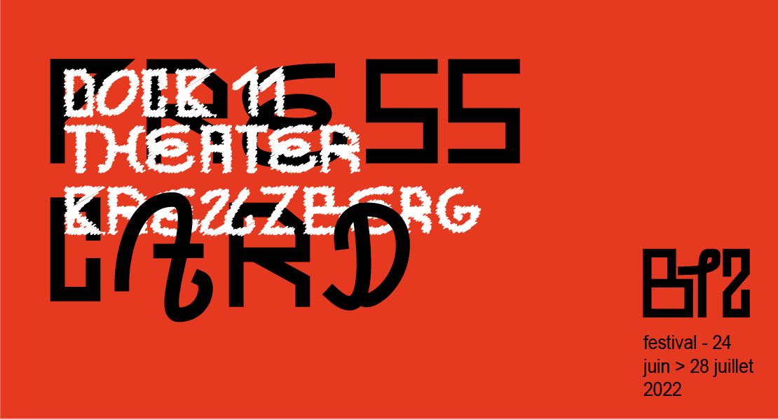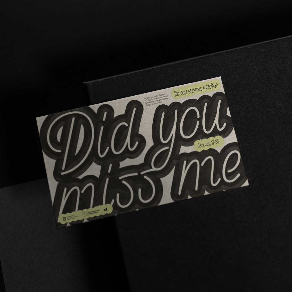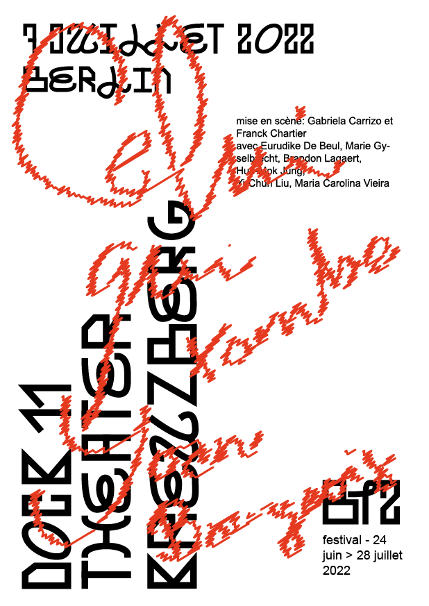

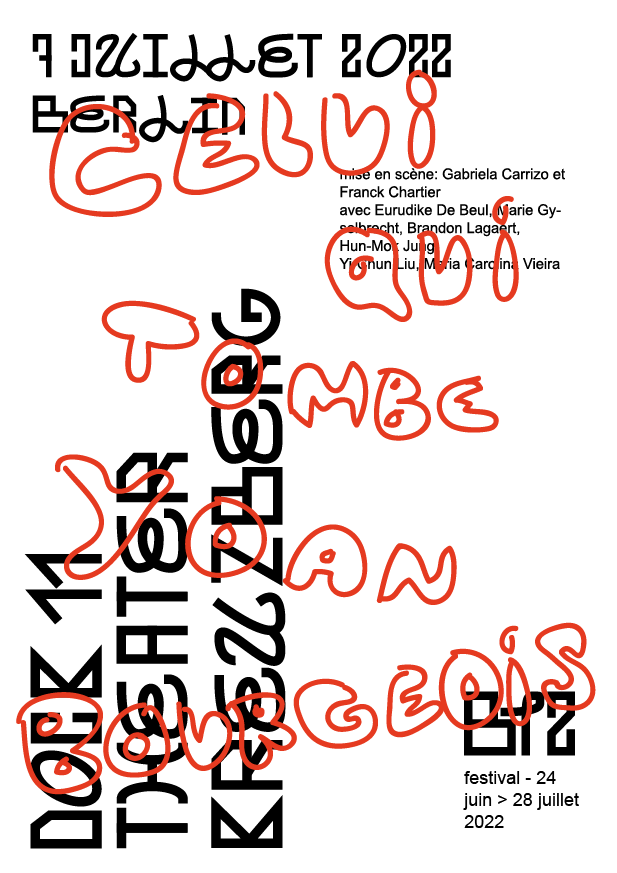
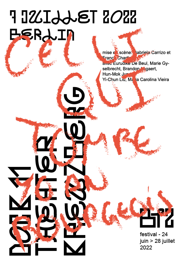
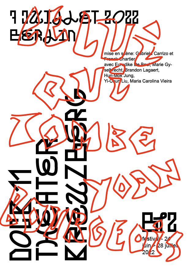
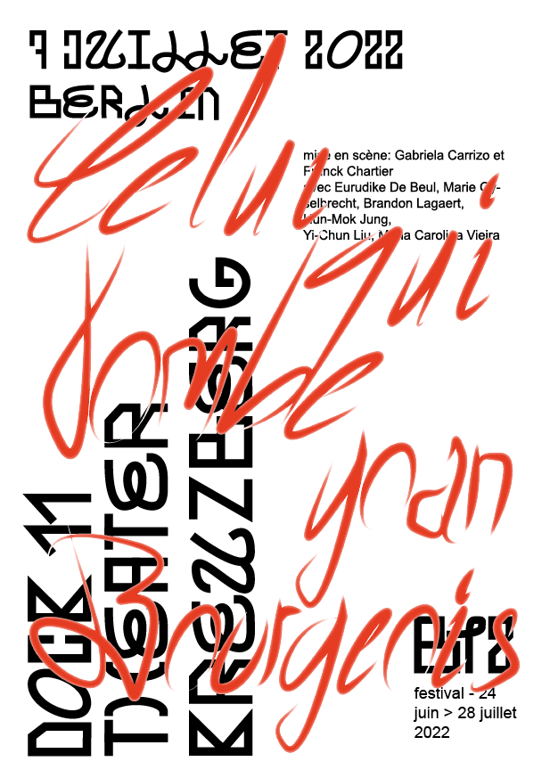

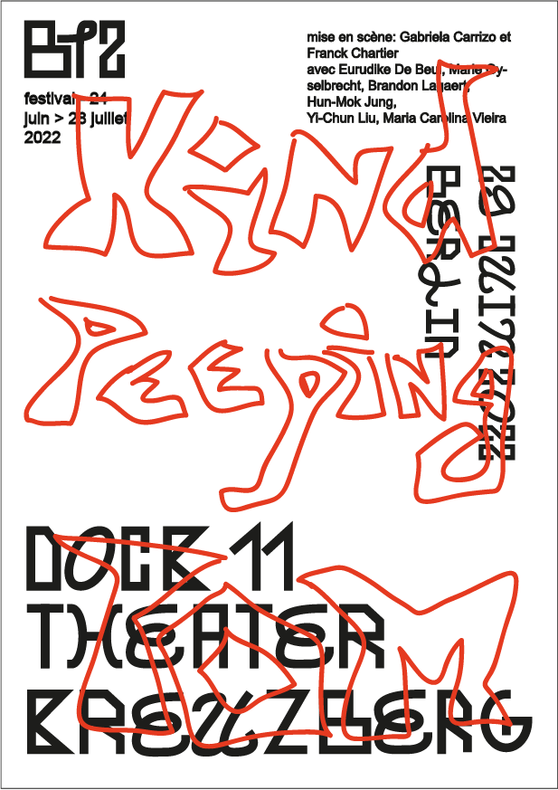
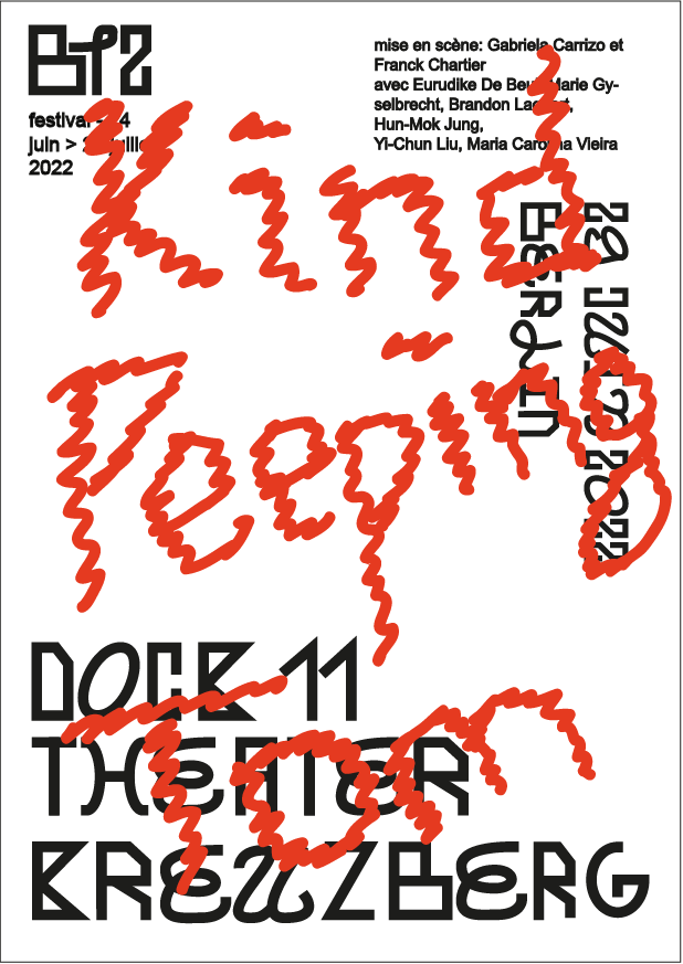


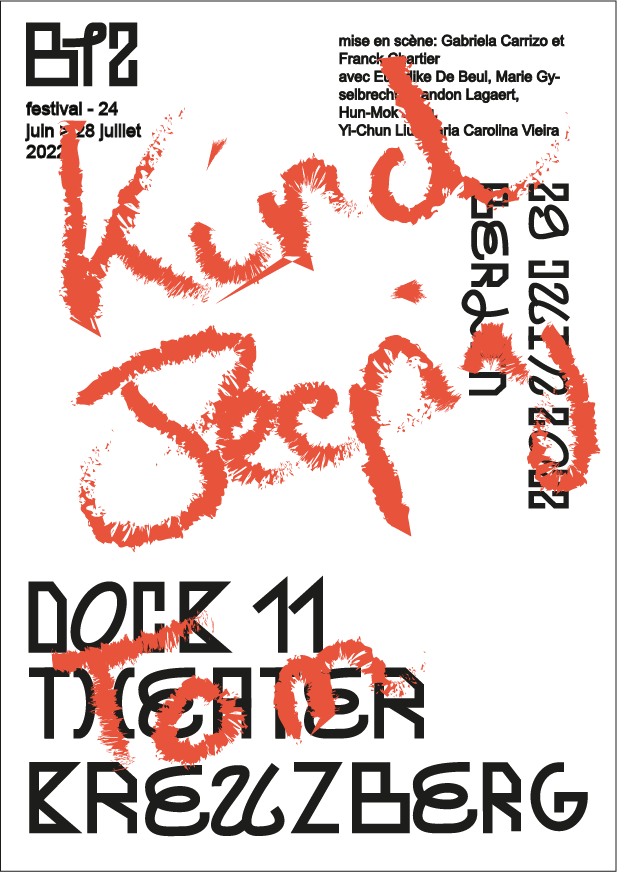


This project involved developing a dynamic visual identity for a contemporary dance festival in Berlin.
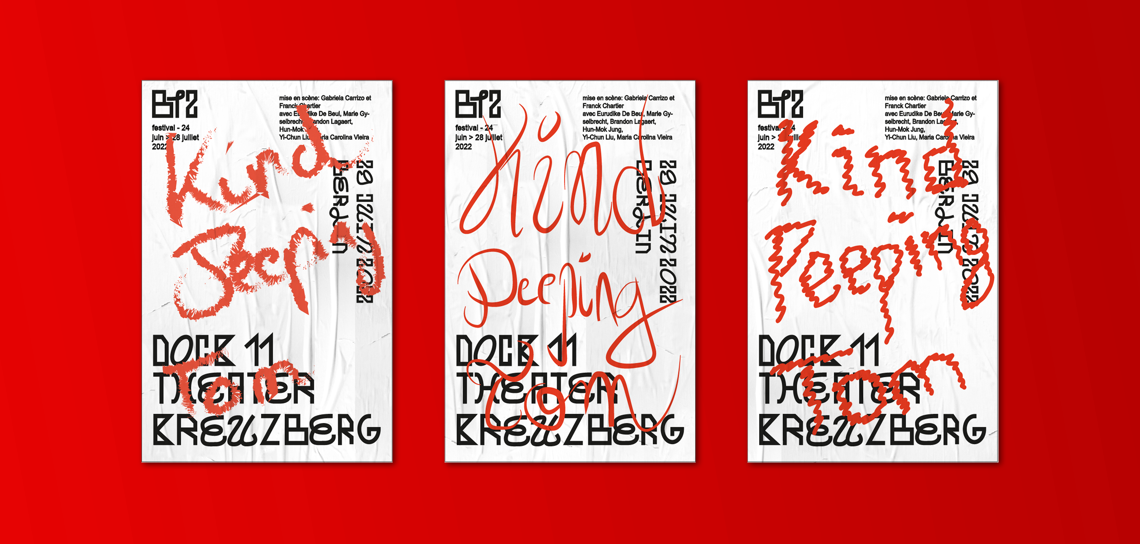
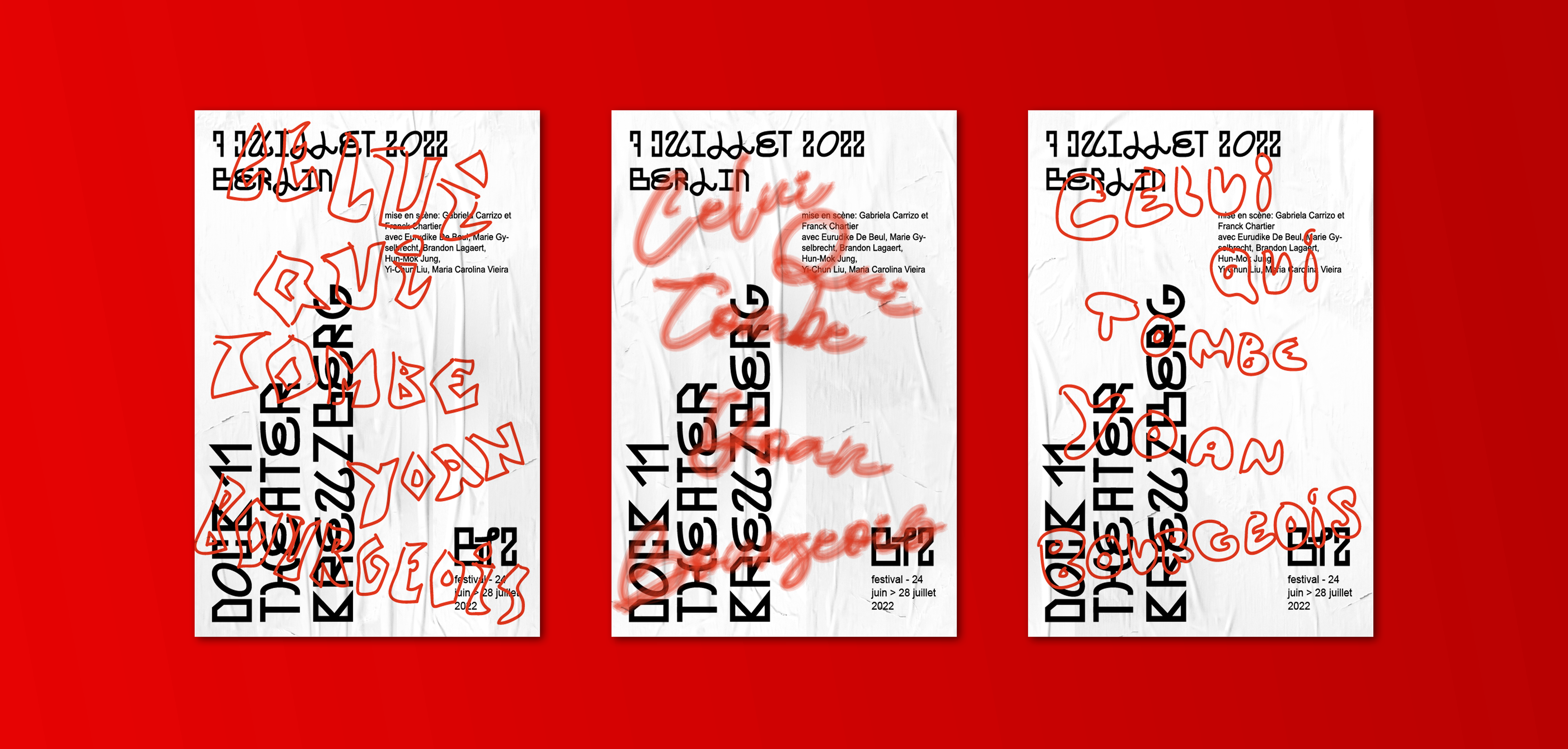
The given theme, “connection,” inspired a graphic exploration of the relationship between print and handwriting. To reflect this concept, a custom typeface was designed, blending bold geometric letterforms with more fluid, handwritten shapes.
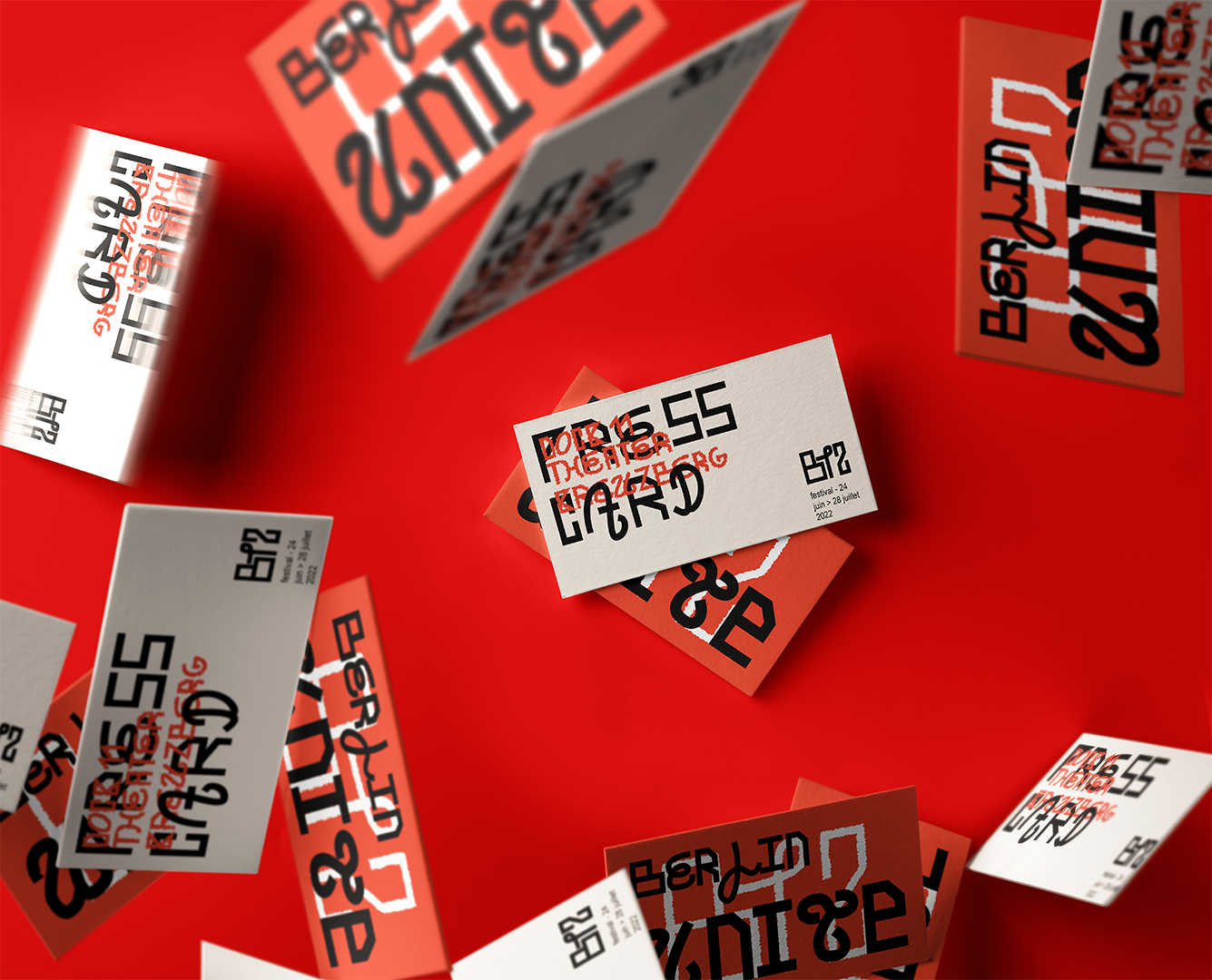
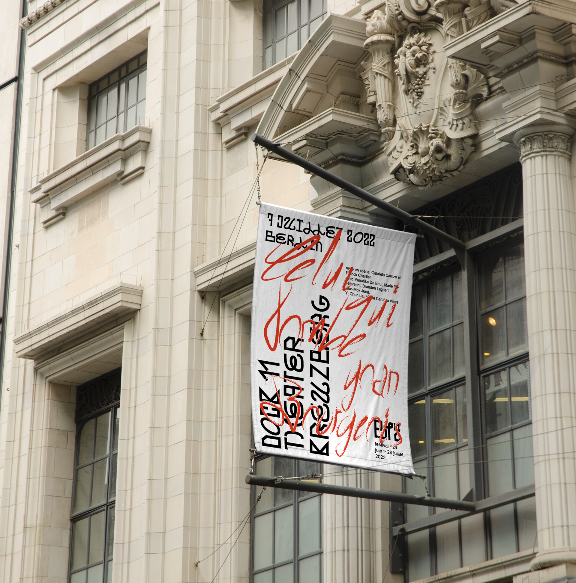
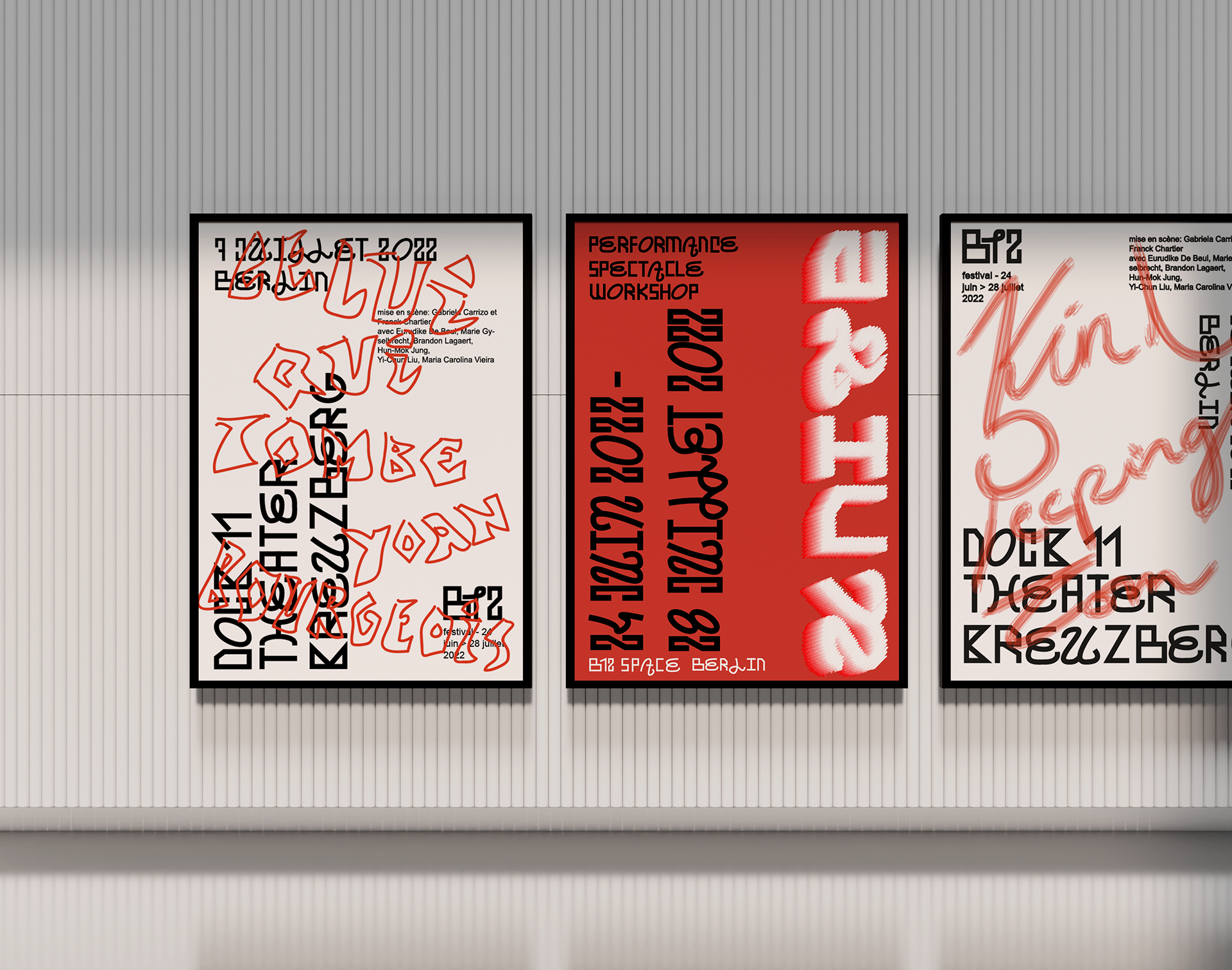
This typeface served as the foundation for monochromatic black posters. The graphic principle was to handwrite the director’s name and the title of the piece directly onto these printed bases, allowing complete freedom in the choice of tools and writing styles. This approach resulted in a series of diverse and unique outcomes, with red being the only constant element—acting as a visual thread connecting all designs.
The interplay between handwritten and printed elements provided a rich variety of posters that captured the festival’s essence. The concept was further developed to encourage audience interaction, inviting visitors to engage with the materials in a playful and participatory way.